
Analysis & Insights – Objective 3
Assign risk levels based on vulnerable populations to identify where and when resources should be deployed.
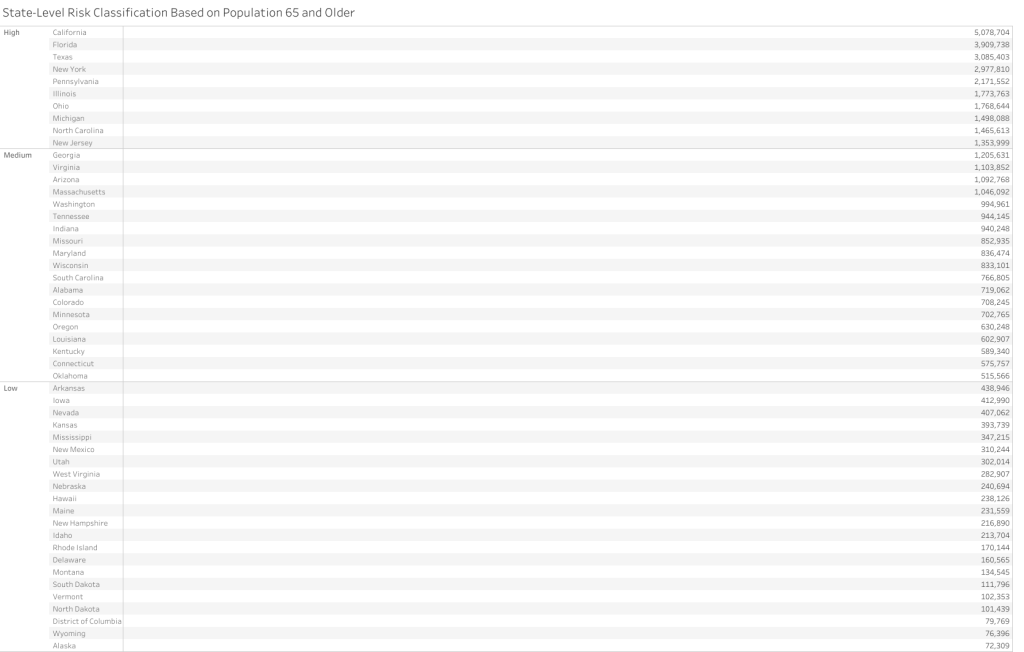
Q5 – Which states are most at risk?
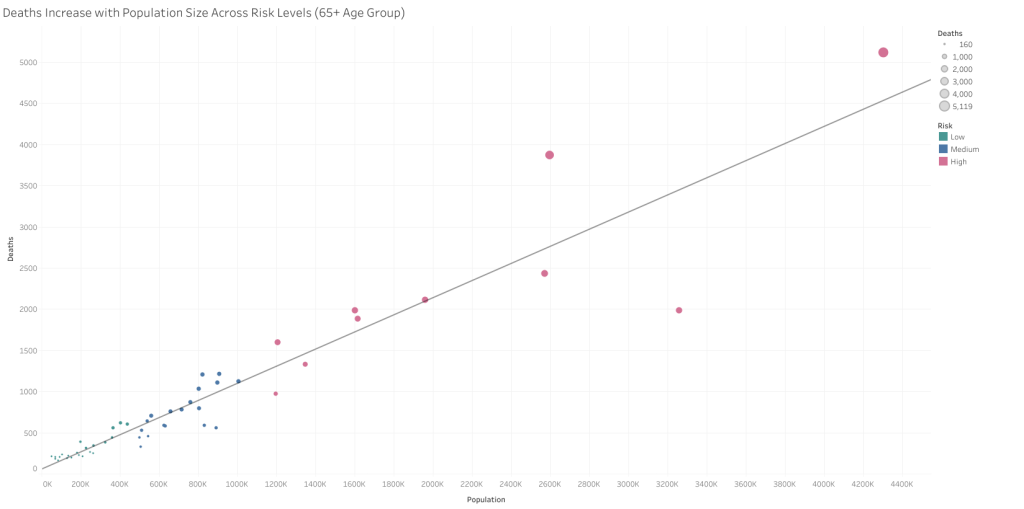
Shading represents the size of the 65+ population, while circle size indicates the number of influenza-related deaths.

States were grouped by 2017 65+ population into low (<500k), medium (500k–1.25m), and high-risk (>1.25m) categories.
A strong positive linear relationship is observed between population size and influenza deaths. States classified as high-risk tend to cluster in the upper-right quadrant, validating the risk groupings.
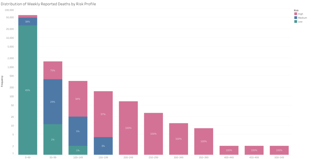
Higher weekly death counts are predominantly driven by high-risk states. Once death frequencies exceed 100 per week, nearly all instances are attributed to high-risk states.
Separate bar charts compare population and death totals by risk profile. Both show a near-linear relationship: as population risk increases, so does mortality.

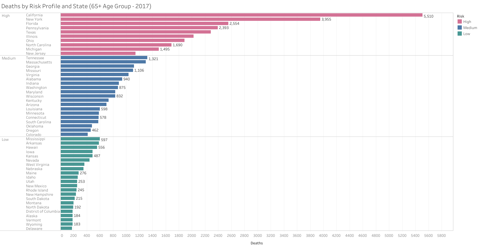
Population Size: High-risk states collectively account for the majority of the elderly population.
Deaths: Mortality distribution mirrors population size, reinforcing the logic of risk-based segmentation.
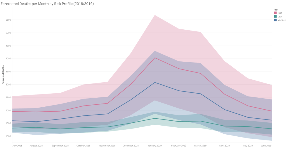
Q6 – Based on risk, when, where, and how many staff should be deployed?
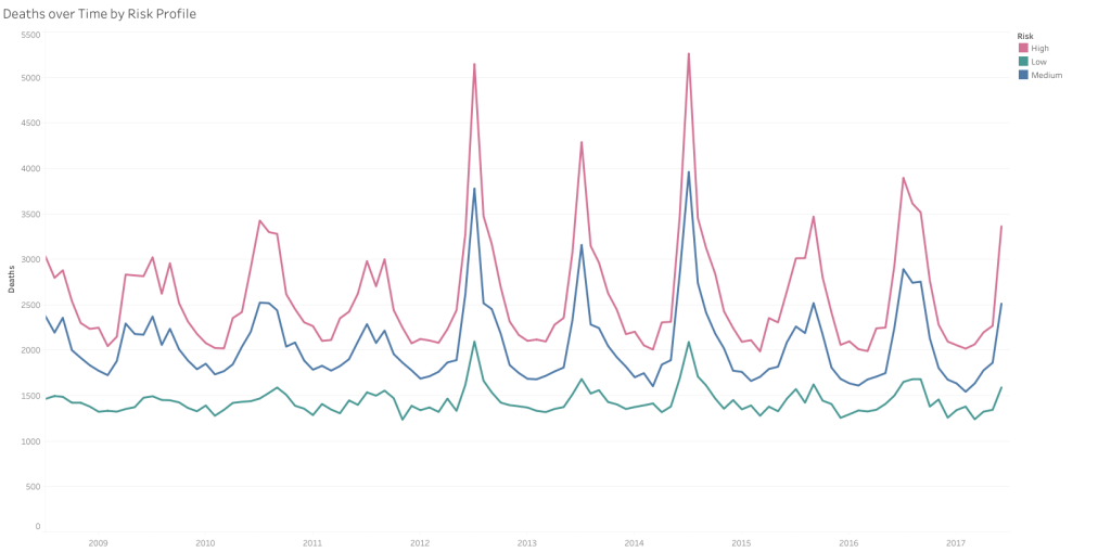
The line chart further illustrates seasonal variation by risk level. High-risk states show sharp fluctuations in winter months, whereas low-risk states exhibit more stable patterns.
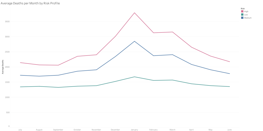
Forecast models for 2018/2019 reveal pronounced seasonal spikes in high-risk states, particularly during peak winter months.